This is super interesting.
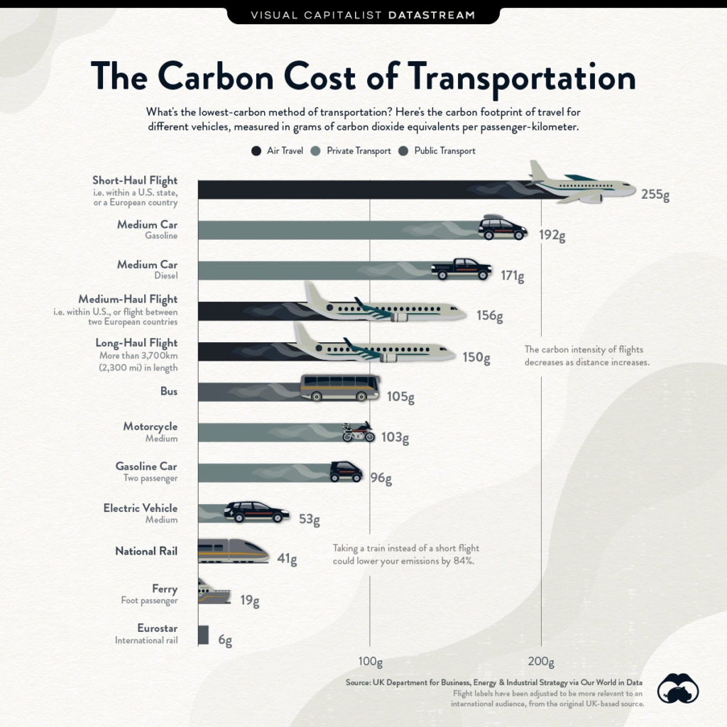
If you've ever wondered what it actually looks like (on average) to travel by car vs by plane, or by plane vs by train, Visual Capitalist have put together a brilliant graphic summary.
It shows the grams of carbon emitted per-passenger-kilometre - so for example, in the graphic you'll see Medium Car (Gasoline) in second spot, and Gasoline Car (Two Passenger) much further down - it's measuring how much carbon is used per person being transported, effectively saying it's more efficient to take 2 people in one trip than driving alone.
Here's the full article with more detail.

For self-employed creatives, normal business traps are easy to fall into and overcomplicate things - but they’re totally avoidable when operating as a company of one.
Learn how to keep things simple, enjoyable, and climate-smart in around 2 minutes a day by joining The Climate Soloist.