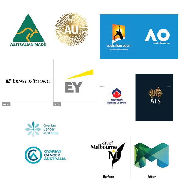
The word “rebrand” might conjure up images of before-and-after logo comparisons.

There are websites dedicated to shredding rebrands up - picking apart the little details that only a designer would notice, and analysing them to death.
These are often labelled as multi-million dollar rebrands, but what rarely comes through unless you’re reading a case study, is the path that was taken to get to the change.
A change in a brand’s visual identity is likely a reflection of a larger change that’s happened within that organisation. Sometimes the change is significant, sometimes it’s superficial, and other times it’s just less obvious. Sometimes the ‘change’ is simply time (as in the brand looked dated and needed a refresh).
Something worth noting, is the fact that the rebrand even happened is kind of a big deal.
Many rebrands never get to the finish line, and (in my experience anyway) it’s often due to a lack of planning.
2 things:
The design part is fun, and it’s easy to get excited talking with designers about concepts and ideas and colours and all the fun stuff.
But don’t ignore the importance of vision setting and planning at the start of a rebrand. It’s just not worth potentially derailing your whole project for the sake of fun.
*Non-scientific percentage. Apparently 88% of statistics are made up 😜
For self-employed creatives, normal business traps are easy to fall into and overcomplicate things - but they’re totally avoidable when operating as a company of one.
Learn how to keep things simple, enjoyable, and climate-smart in around 2 minutes a day by joining The Climate Soloist.