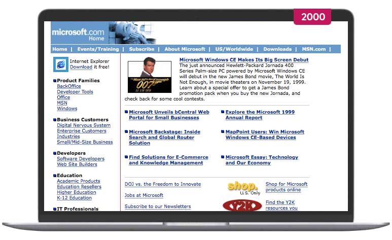
One of my favourite non-fiction books, Don’t Make Me Think, was originally written in 2000 and is mostly about building better websites.
Have websites changed much in that time?


I’m going with yes.
Can a book that was written in 2000 about web design really still be relevant in 2023?
Also yes.
What the book focuses on is not design styles, or integrations, or the metaverse, or a hot trend.
It’s simple usability, and those rules rarely change.
Here’s an excerpt:
All kinds of things on a Web page can make us stop and think unnecessarily. Take names of things, for example. Typical culprits are cute or clever names, marketing-induced names, company-specific names, and unfamiliar technical names.
The point is, when we're using the Web every question mark adds to our cognitive workload, distracting our attention from the task at hand. The distractions may be slight but they add up, and sometimes it doesn't take much to throw us.
And as a rule, people don't like to puzzle over how to do things. The fact that the people who built the site didn't care enough to make things obvious - and easy - can erode our confidence in the site and its publishers.
The concept of usability is not limited to websites.
I’ve re-read the book maybe a dozen times, and that line above, people don't like to puzzle over how to do things, is sticky.
I bet if you scanned your homepage there'd be at least one thing you could help people not have to think about...
For self-employed creatives, normal business traps are easy to fall into and overcomplicate things - but they’re totally avoidable when operating as a company of one.
Learn how to keep things simple, enjoyable, and climate-smart in around 2 minutes a day by joining The Climate Soloist.